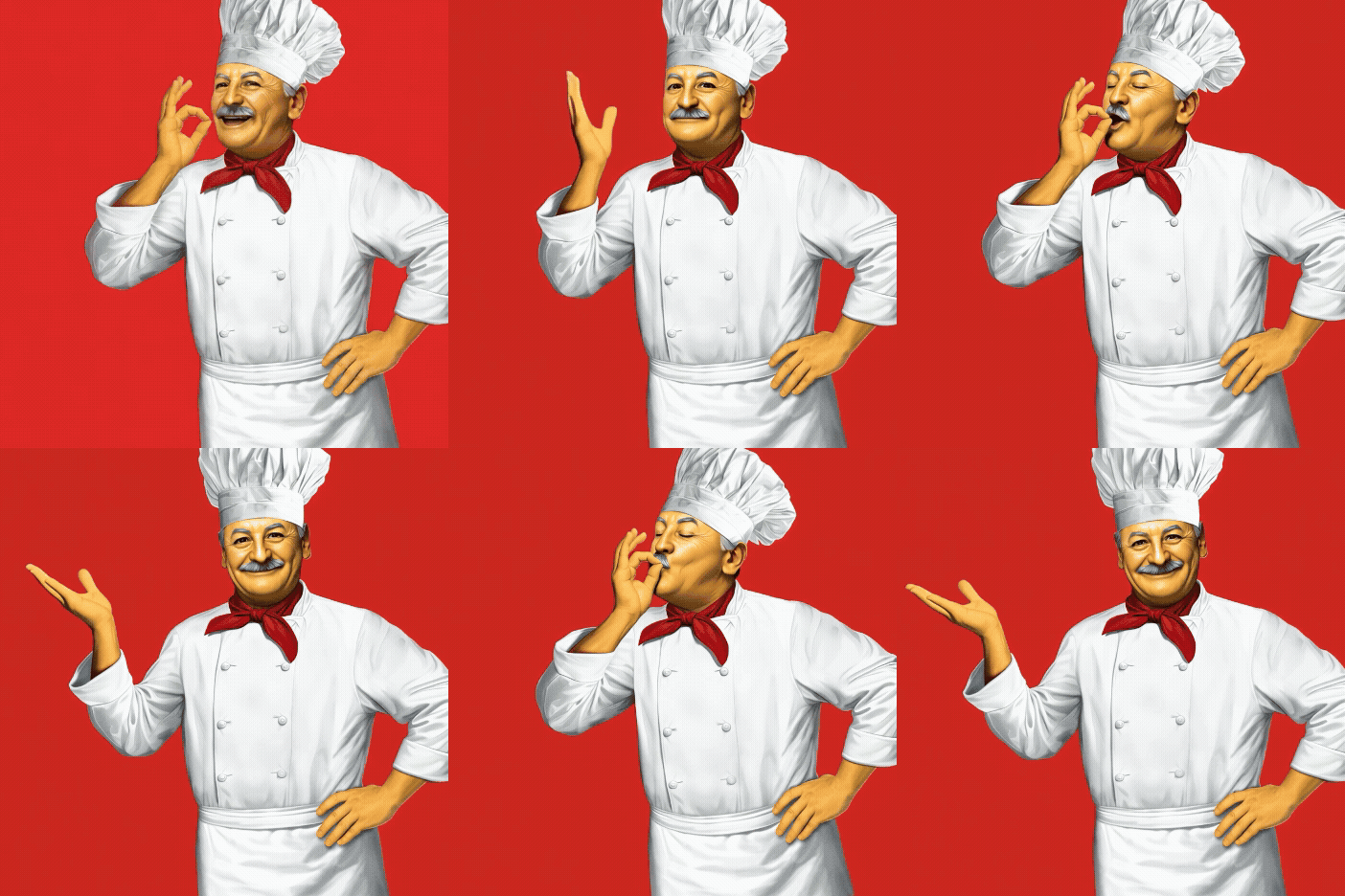
Chef Boyardee was ready to modernize while staying true to its heritage roots.
The problem: For nearly 100 years, Chef Boyardee has been a staple in American pantries, loved for its hearty, affordable Italian-style meals and unmistakable sense of nostalgia. But while the brand’s emotional equity has remained strong, its identity had lost relevance with today’s consumer.
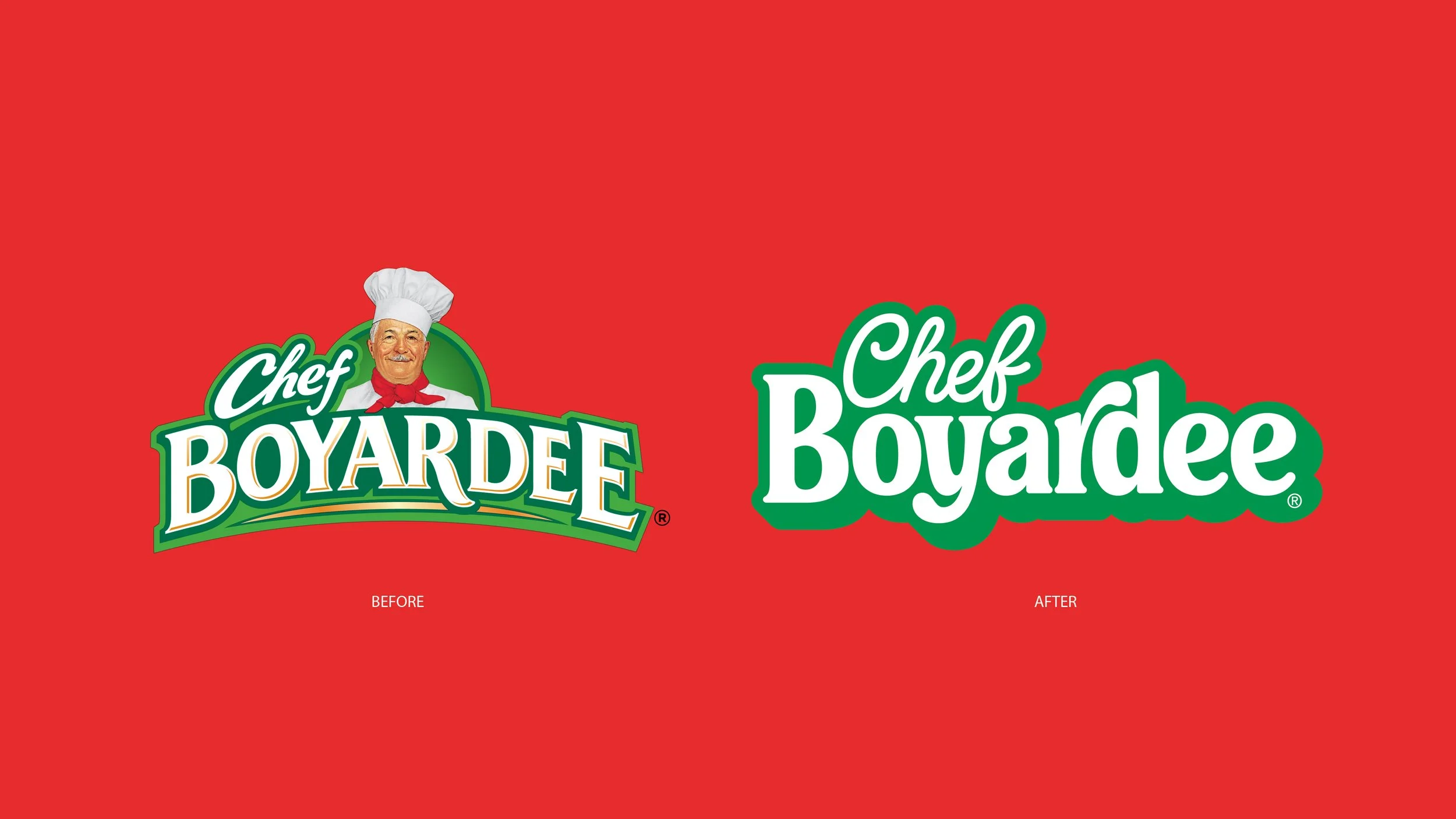
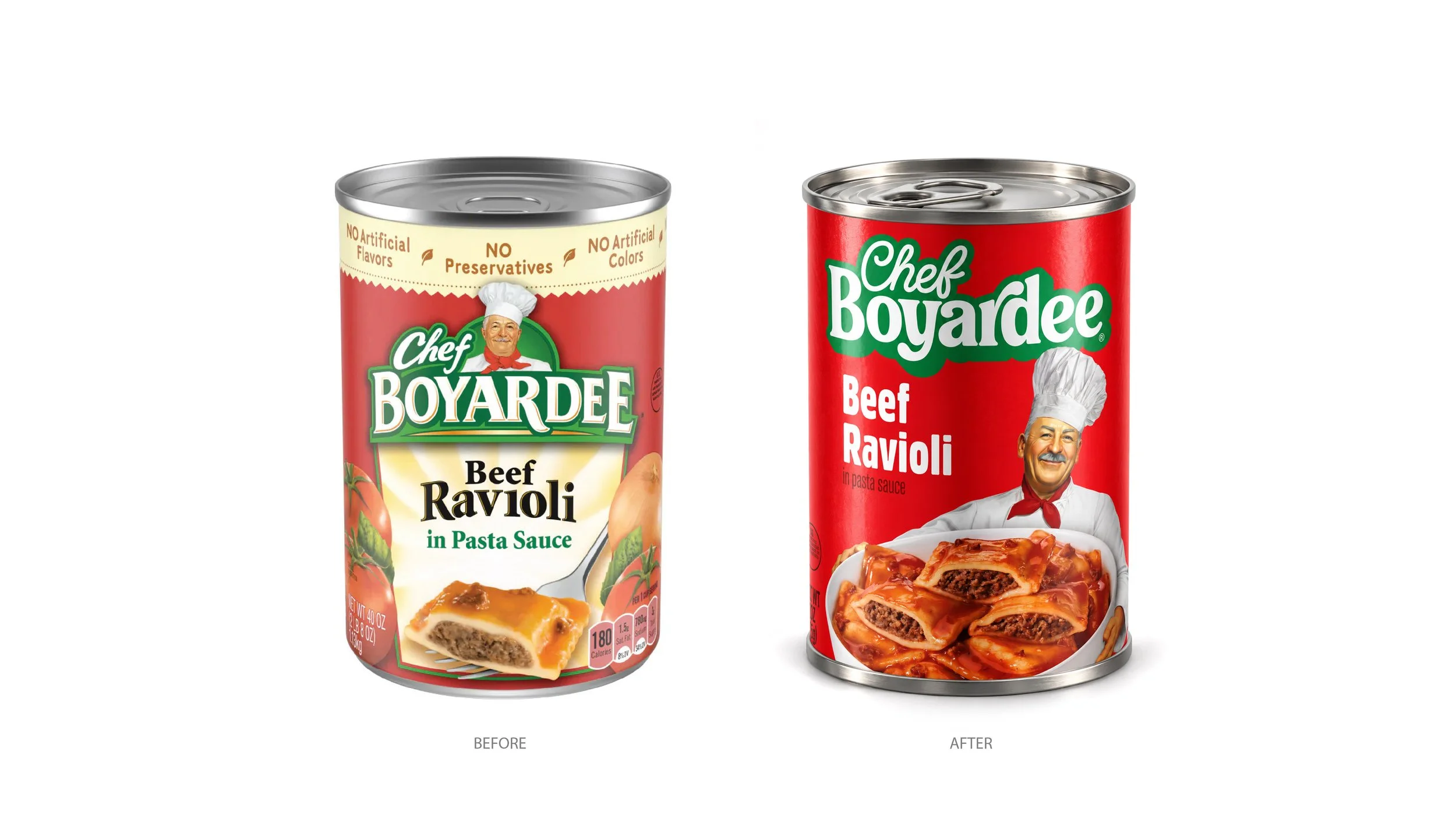
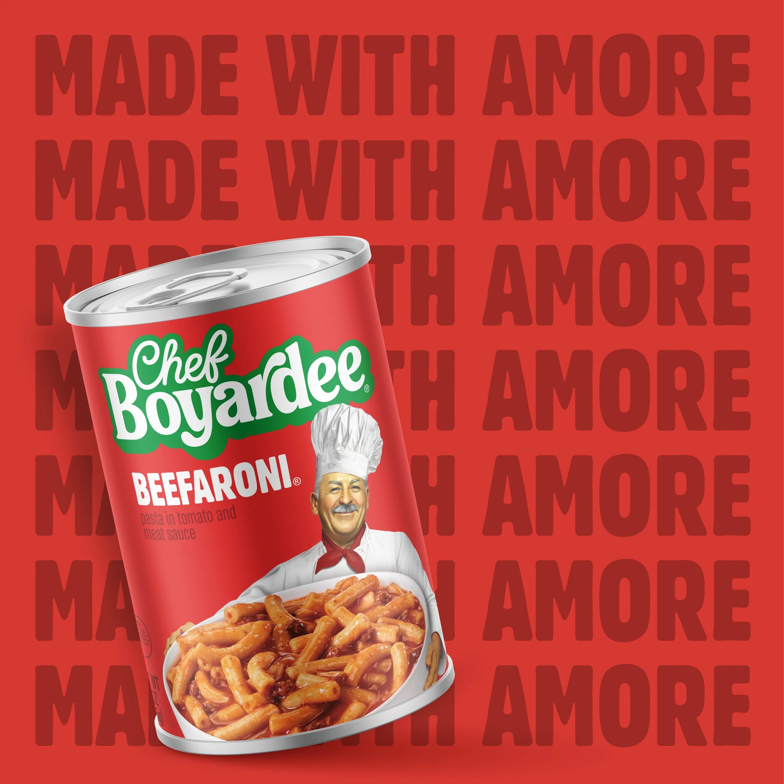
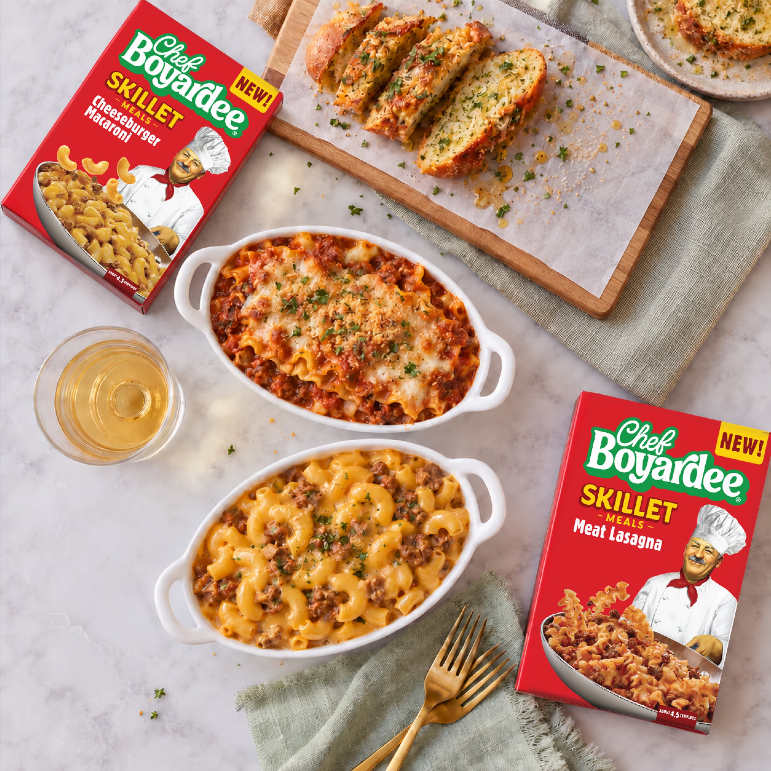
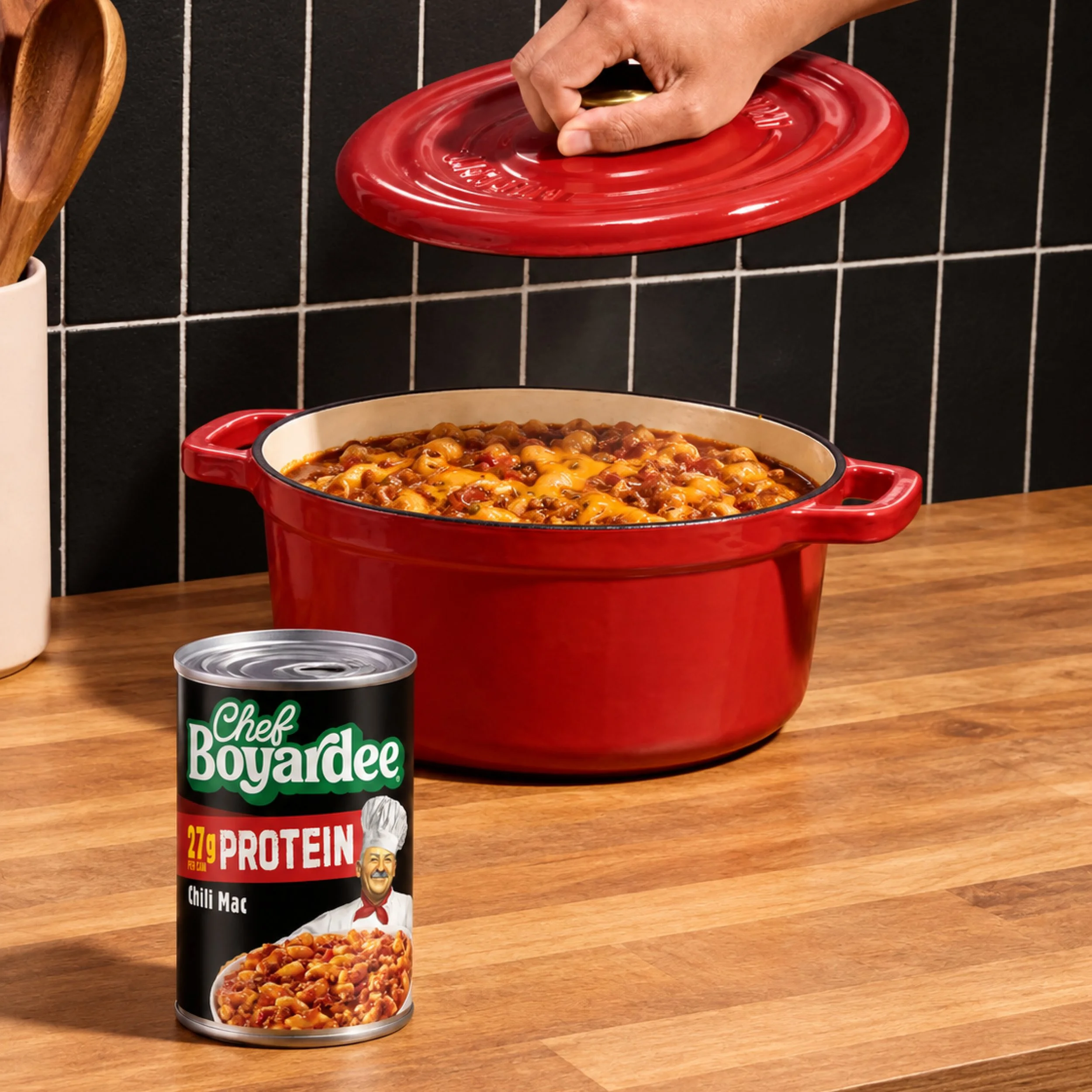
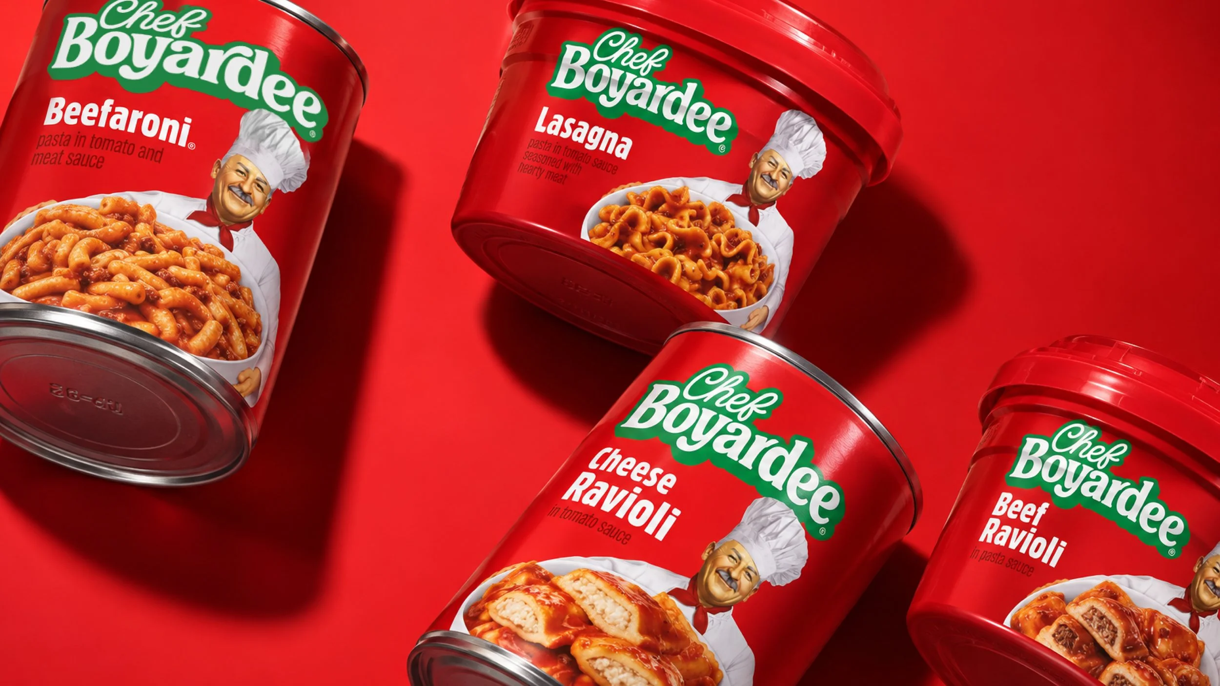
The solution: A comprehensive brand identity that brings Chef Boyardee back to the forefront and modernizes the visual identity for a new generation. A revitalized word mark, richer food photography, and a streamlined design system create a stronger, more craveable shelf presence while preserving the warmth, familiarity, and personality that have made Chef Boyardee a beloved American classic.
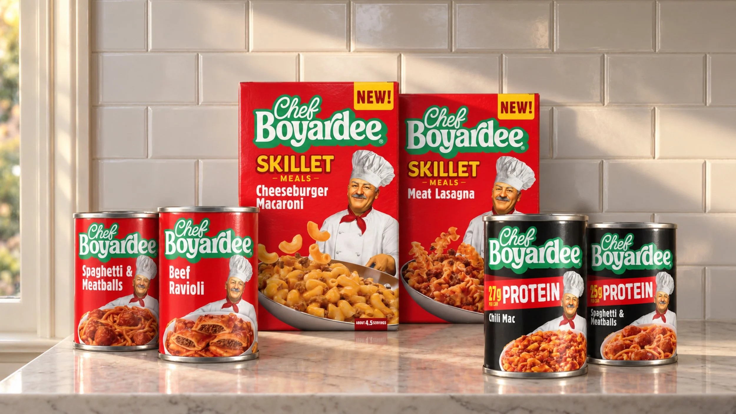
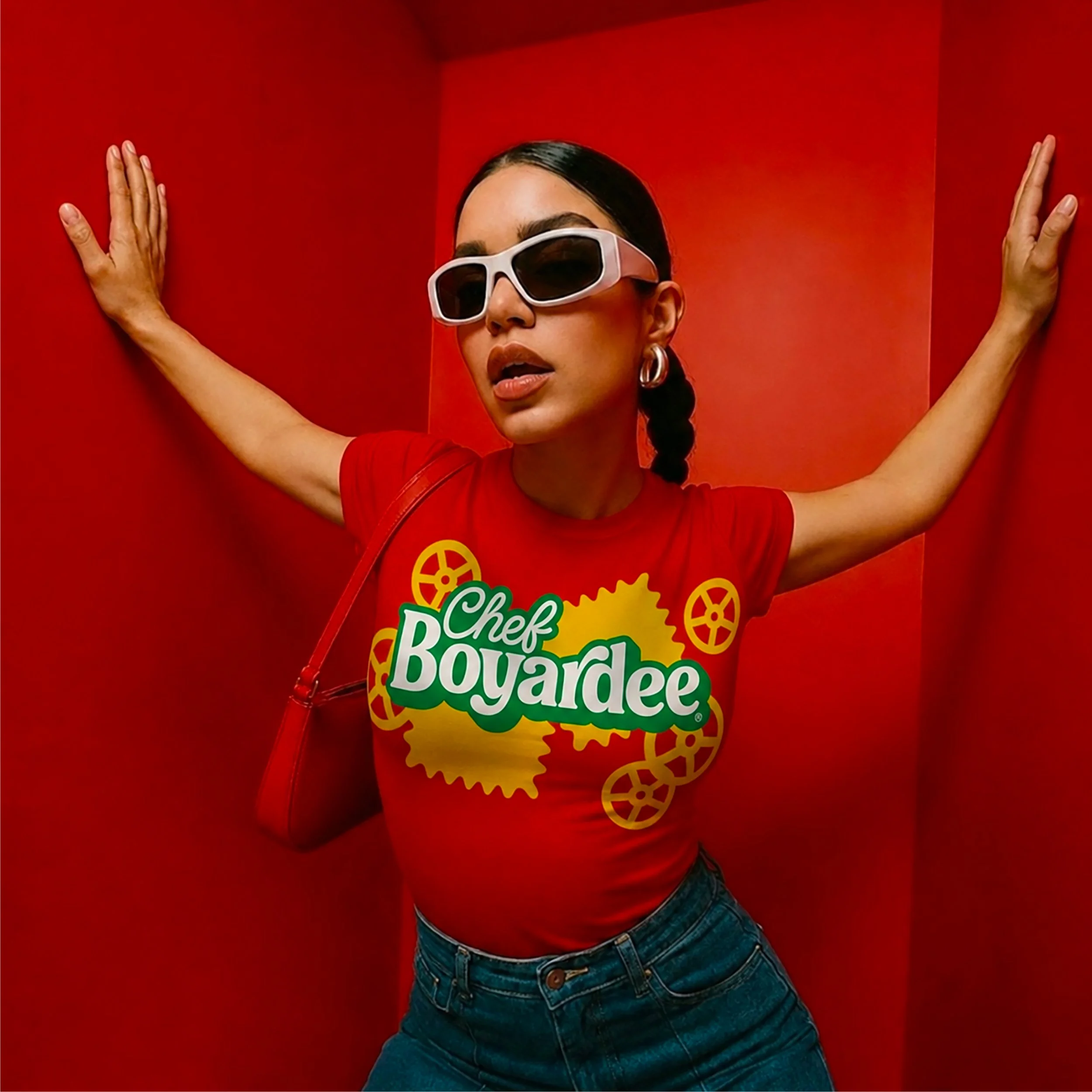
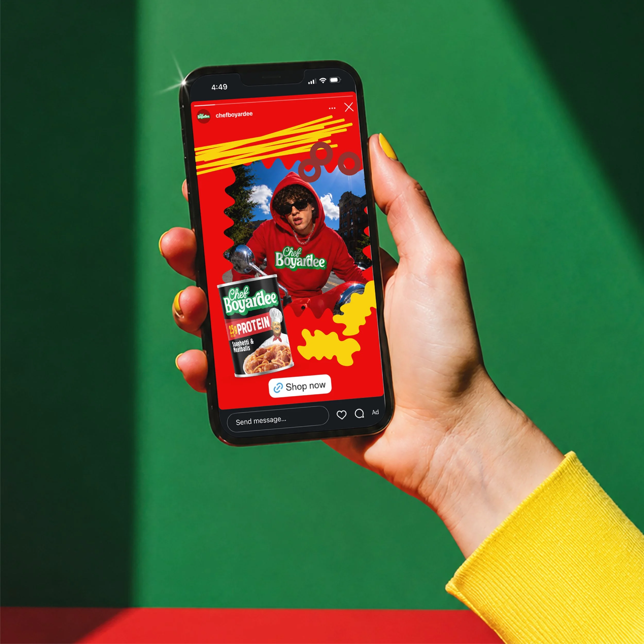
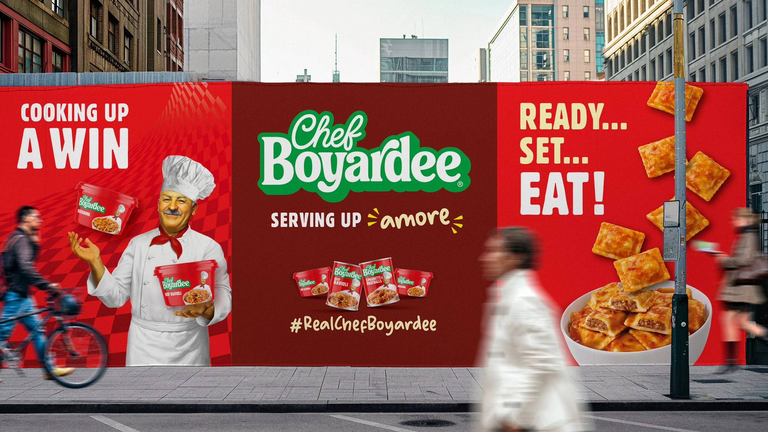
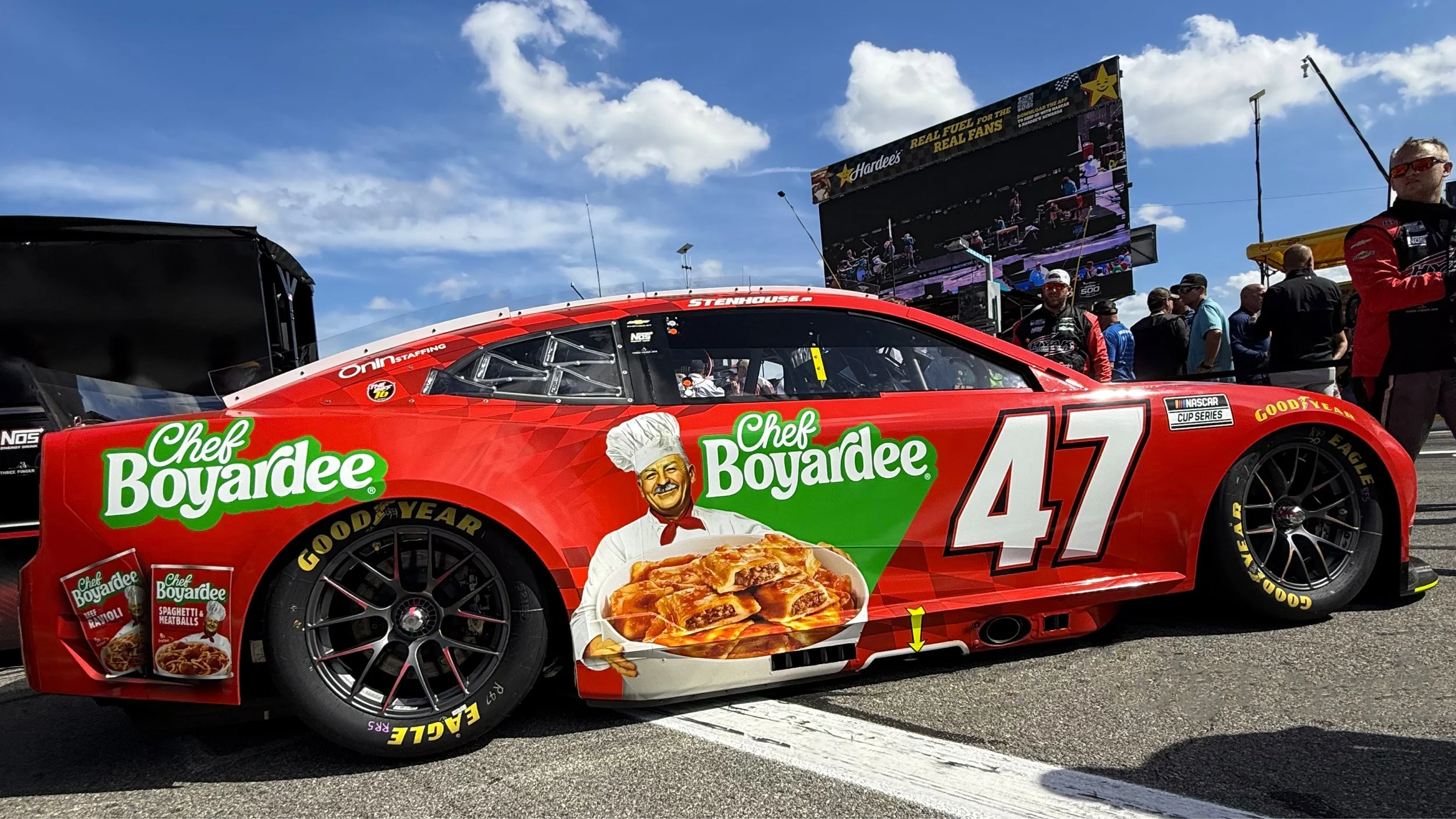
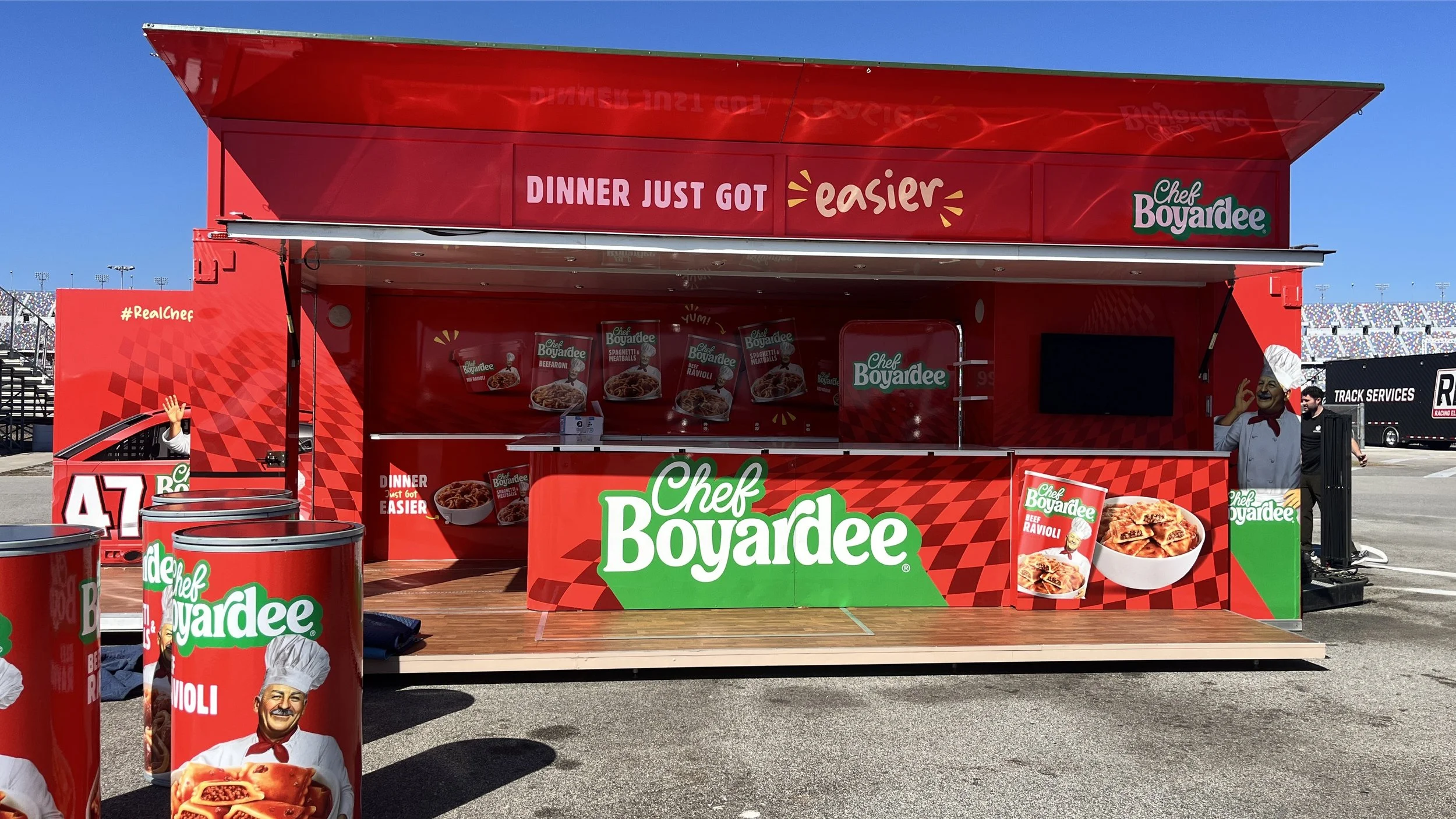
The thinking: The refreshed identity balances heritage with modern appetite appeal through an updated logo inspired by the brand’s history, tastier food photography, a more expressive Chef illustration system, and stronger shelf architecture rooted in iconic red. Across every touchpoint, the brand world celebrates what people have always loved most: full plates, real ingredients, and easy comfort made with heart.
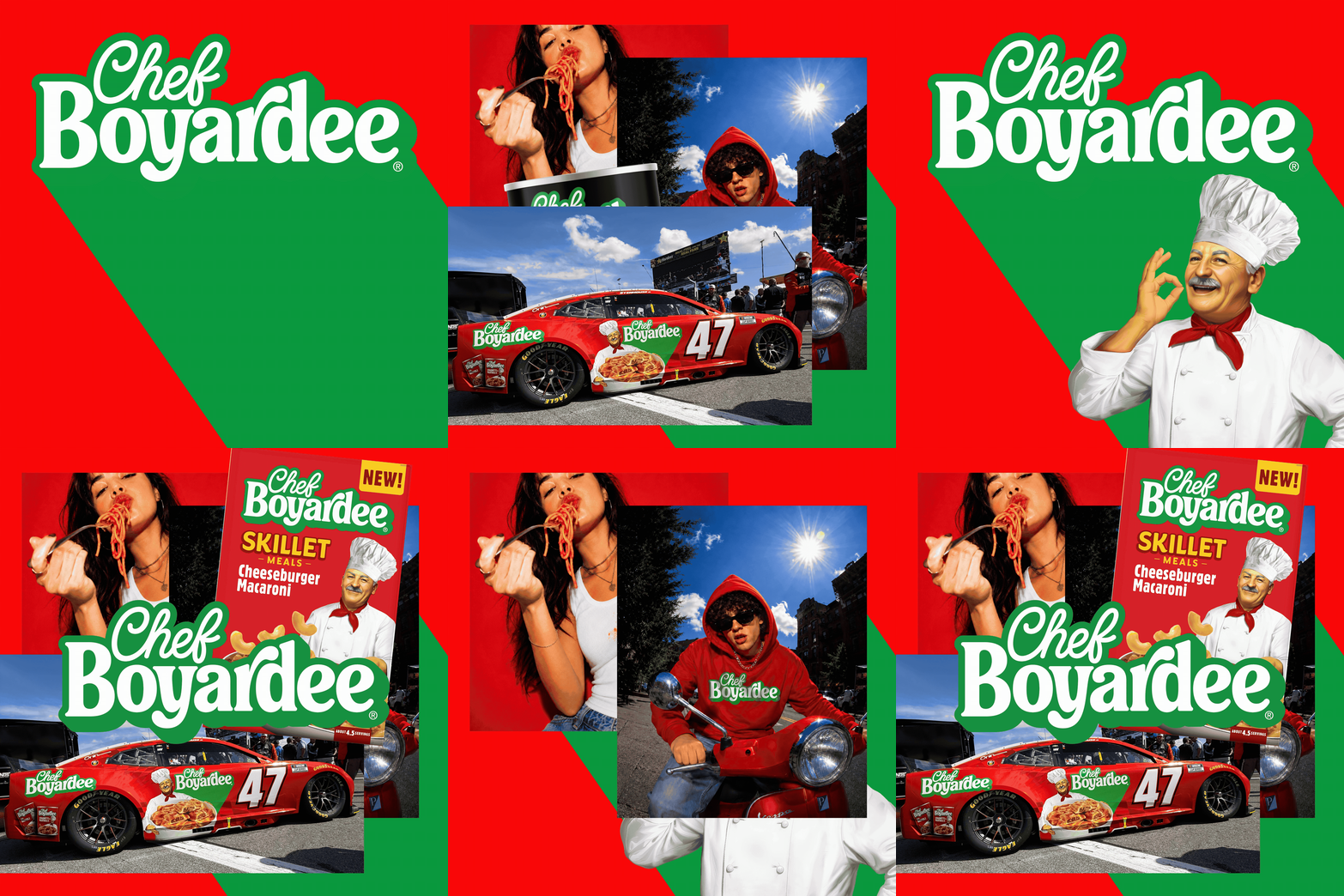
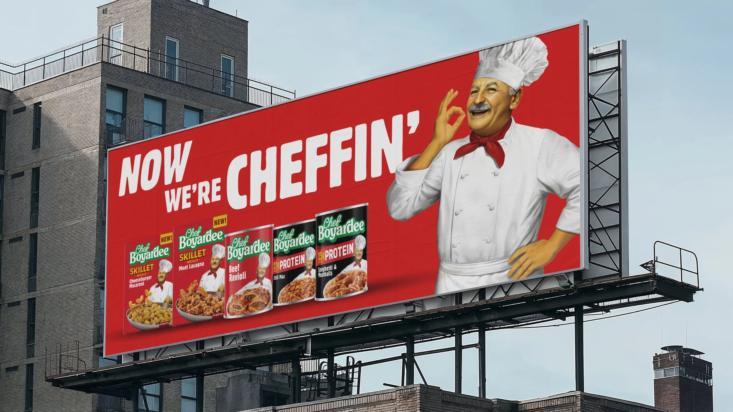
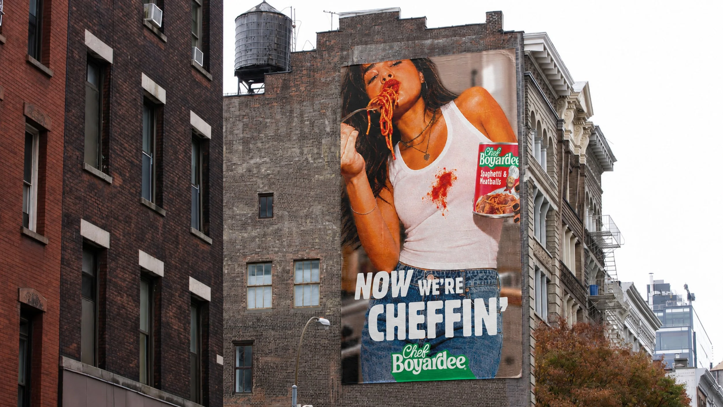
The rebrand also set the stage for the brand’s first advertising campaign in nearly 20 years. With an entire generation of consumers unfamiliar with Chef Boyardee, we sought to reintroduce the iconic Chef and his timeless appeal while bringing awareness to a new generation of products, including Skillet Meals and Protein offerings. The result is a Chef Boyardee that feels both instantly familiar and ready for today’s table.
The client: Chef Boyardee
The team: Little Big Brands
The skills: Creative Strategy | Brand Identity | Packaging | Illustration | Art Direction | Digital Activation | Brand Guidelines | Advertising